Ceres Home

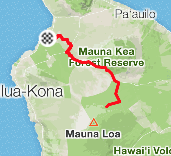
Waikoloa to Mauna Loa
From the Pacific Ocean, to (nearly) the top of Hawaii's Big Island
100 miles + 10,000 feet + 🚲
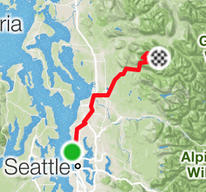
Seattle to Three Fingers Lookout
Bike home to Three Fingers Lookout trailhead @ Granite Falls. Hike to the lookout. Reverse. 150 miles + 11,000 feet + 🚲 + 🥾
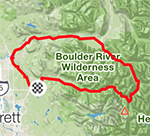
Mountain Loop Highway century ride
100-mile bike ride starting and ending in Granite Falls. Included ~15 miles of dirt road. 100 miles + 5,000 feet + 🚲
Mount Constance Olympic NP climb
Biked the Dosewallips River and hiked and climbed Mount Constance with Mike. 20 miles + 10,000 feet + 🚲 + 🥾
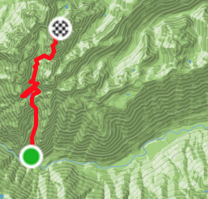
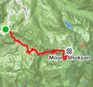
Mount Shuksan Fisher Chimneys
Hiked and scrambled my way up majestic Mount Shuksan with Zaher. 20 miles + 6,000 feet + 🥾
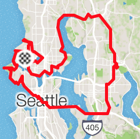
Bike ride around Lake Washington
All of the Burke-Gilman Trail and a bit more over I-90 and around Ballard.
75 miles + 🚲